Cellular Overview
In the Cellular Overview tab, you can view and analyze the data for all units.
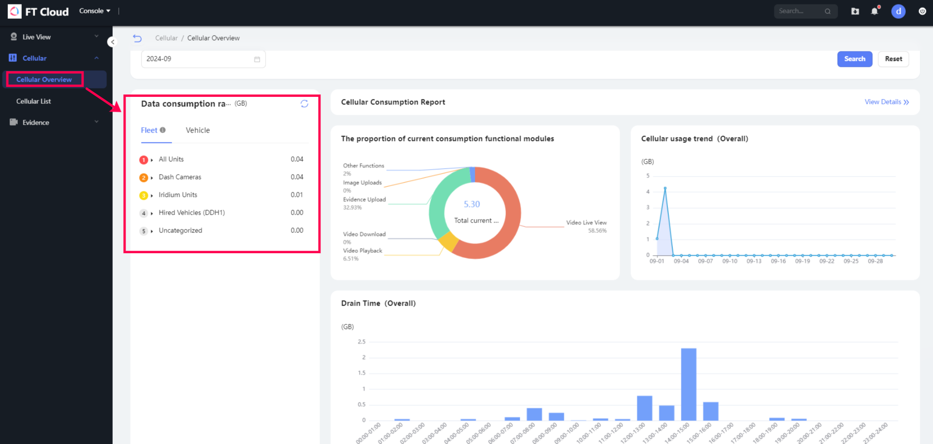
It displays data consumption ranking for each unit. You can choose different viewing options including either Average of the vehicles in the fleet or Vehicle only:

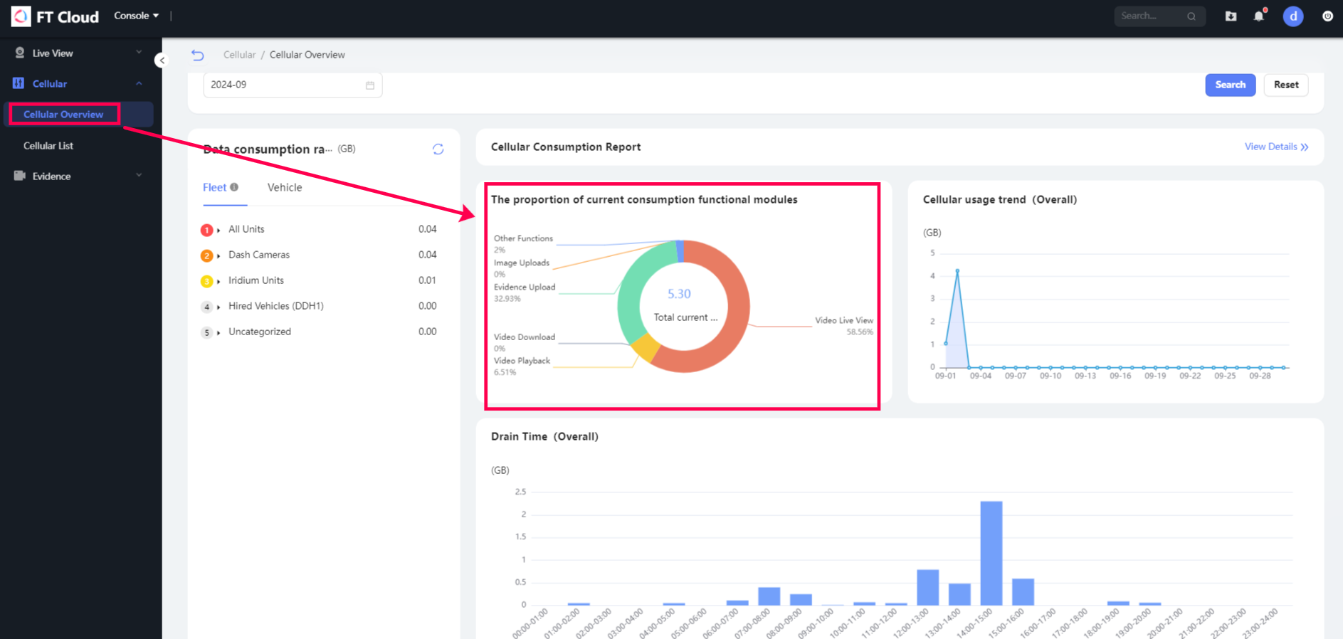
You can also view the Proportion of current consumption functional modules. It uses a pie chart to display different consumptions of the different areas of data:

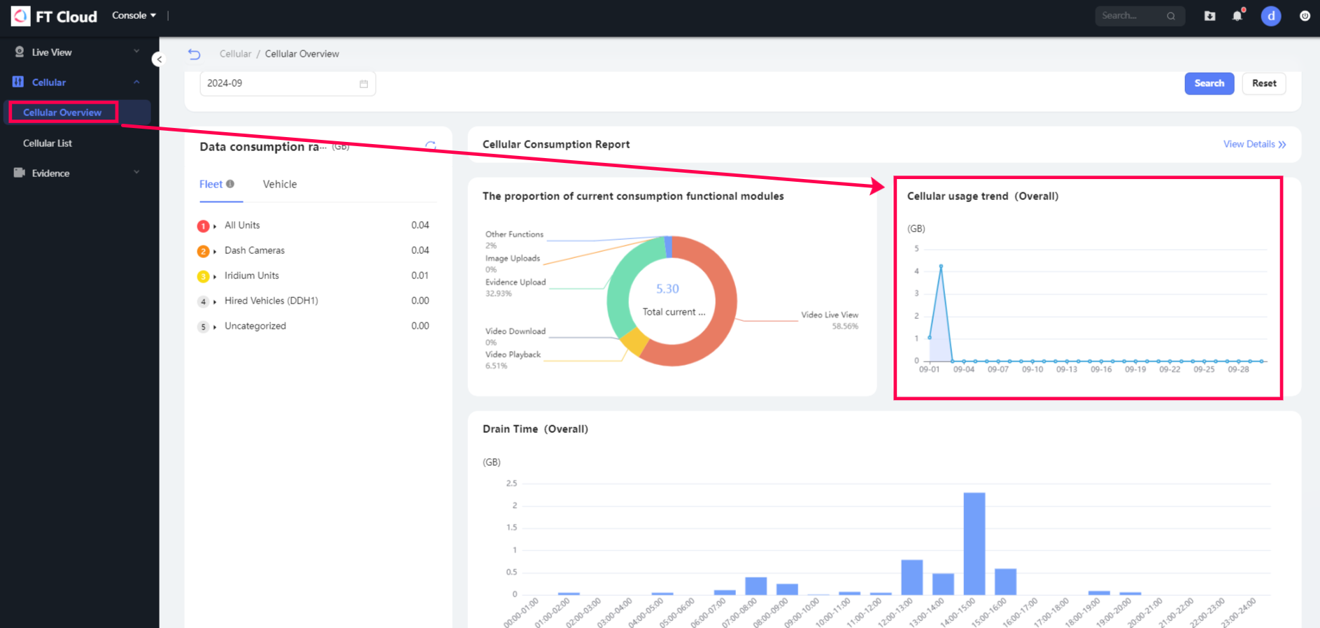
To the right of the pie chart, it is a line chart that displays the Traffic usage trend. You can view the overall amount of data the units use during specific time intervals:

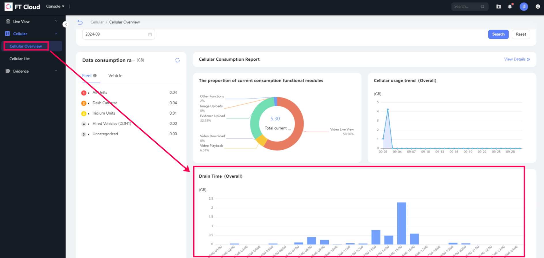
Below the line chart, it is a bar chart to displaying the overall drain time of data usage for specific time intervals:

It displays data consumption ranking for each unit. You can choose different viewing options including either Average of the vehicles in the fleet or Vehicle only:
You can also view the Proportion of current consumption functional modules. It uses a pie chart to display different consumptions of the different areas of data:
To the right of the pie chart, it is a line chart that displays the Traffic usage trend. You can view the overall amount of data the units use during specific time intervals:
Below the line chart, it is a bar chart to displaying the overall drain time of data usage for specific time intervals:
Related Articles
Function Overview
FT Vision includes extensive functions and features as outlined below: 1. Real Time Monitoring a. Live GPS locations of vehicles b. Real-time live video feed c. Manual video feed recording d. Real-time two-way voice communication with driver 2. ...User Settings Overview
User Settings Overview Users can configure some system operation parameters according to their needs and tasks. To view user settings click on the username in the top panel and then choose User Settings in the menu. The User settings window can ...Overview
FT Vision is a cloud-based, remote video monitoring application, which provides access to a live video feed from camera hardware as well as event-based video evidence triggered by harsh driving and other possible impacts. FT Vision also has a ...Cellular List
In the Daily usage report tab, you can view detailed data usage for each vehicle. By specifying the relevant date/s or license plate number, you can see the total consumed traffic during the specified date and individual consumed traffic for each ...1. Overview
Trackd is a cloud based software platform that promotes advanced security, ensures precise location detection and total visibility into the performance of your vehicles and assets through real-time monitoring. It has powerful analytics, alert and ...